
It may not have the glamor or splendour of fine art or antiques, but selling used industrial assets...
Back in May 2015 Google said that ‘more Google searches took place on mobile devices than on computers in 10 countries’. So, the answer to the question of whether your website needs to be compatible with mobile devices is simple: Yes!

What Makes a Website Mobile-Friendly?
There are many factors that make a site mobile-friendly, but the top considerations are ease of use and speed. Being able to design the user interface in a way that gives the user a positive experience on your mobile website will improve your retention rate immensely. If you give them an unsuccessful encounter with your site, as many people view the web on their mobile devices, they will be unsatsfied with your company immediately. I can not stress enough how essential this characteristic is for the success of your business.
We are in the age of Digital Marketing! If you want to check the mobile-friendly score of your website you should READ THIS.
Ease of Use
This is perhaps subjective, but let’s be honest, we’ve all visited sites from our mobile where we’ve pinched and stretched and scrolled until we’ve had enough and left. This is why it’s so important to be mindful of user experience.
See what Virgin America is doing to improve their customer experience.
Put yourself in your customer’s shoes; go to your website now from your mobile. What is it your customer needs the most?
- Do they need your phone number? Is it prominent? Can they click the number to call you?
- Do they need to find your shop or services page? Is this really clear from the home page?
- Is the navigation easy to find and use? A multi-layer navigation with lots of sub-menus may work well on a desktop computer, but can be incredibly frustrating for a mobile user if it’s not set up correctly.
- Is there room for white space and is the page uncluttered?
- Is there one content piece per screen so that the customer doesn't get confused and is able to scroll to the next?
Make a list of your frustrations. Now look at some other B2B websites, perhaps in your industry or those of major brands – do they give a better experience? Use what you learn to work with a web designer to get the necessary changes made to your site to make the user experience seamless. View this page for the User Experience Awards for 2017.
Speed
Many of us enjoy 4G connections on our mobile phones; others, especially in rural areas, are not so lucky. A page that loads for you in a matter of seconds could take minutes for someone else.
There are many tools online that can test the speed of your site – these independent results are a much better evaluation than your own experience. Two you can try are:

How to Speed Things Up
If you work with a web developer they will be able to make several recommendations to shave those precious milliseconds off your load time, but there are a few good practices that anyone can implement to improve their website performance.
- Optimize images- this is one of the biggest causes of a slow site. Reducing your images’ physical size and resolution will have a big impact on file sizes and therefore how quickly they load to your website
- Break your content up- if you have an article which is 3,000 words long, with graphics, video and more throughout, consider putting this on several pages that link to each other. The visitor will then be requesting just one page at a time.
- Retest your site regularly- good practices only work if they’re applied consistently. A single large photograph on a page can eliminate all your hard work, so test your new or updated content regularly.
A study within Smashing Magazine states, "more than 80% of people are disappointed with the experience of browsing Web on mobile devices and would use their smartphones more if the browsing experience improved".
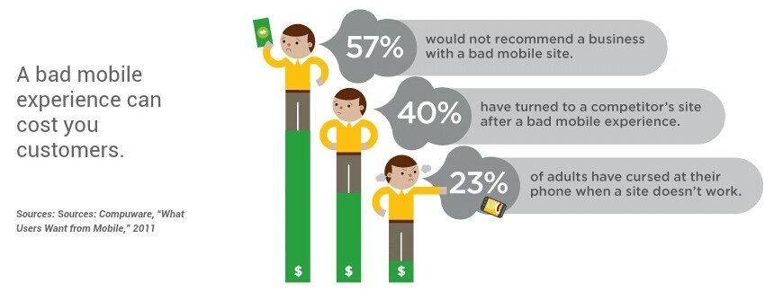
The Cost of Being Unfriendly
I work with business owners and marketers to drive traffic to their websites, often through direct mail and email. Whilst we can work hard to refine targeting and messaging, what is outside of our control is the device the person is using when they respond.
I’ve seen highly successful campaigns that have generated high rates of return (so, high click through rates from emails, for example), only to receive feedback that the sales results were poor. If your marketing message is genuine and accurate, and the response rate is high, it stands to reason that you have reached the right potential buyers, and so something else must have interrupted the journey through the sales funnel. Having a responsive web design is critical.
Summary
- There are many factors that influence how mobile-friendly your website is. The top two are speed and ease of use.
- Having a website that’s not mobile-friendly will reduce the response from your marketing campaigns and impact your return on investment.
- Don’t let user experience and website pace be the cause of wasting your precious marketing dollars.
Wanna know what your customer is seeing? View Our Article HERE.
If you would like to work with a marketer who goes further to understand not just your marketing objectives, but your sales funnel, too, call me today. You can reach me, Donna Peterson, on +1 860-210-8088 or email dpeterson@worldinnovators.com.